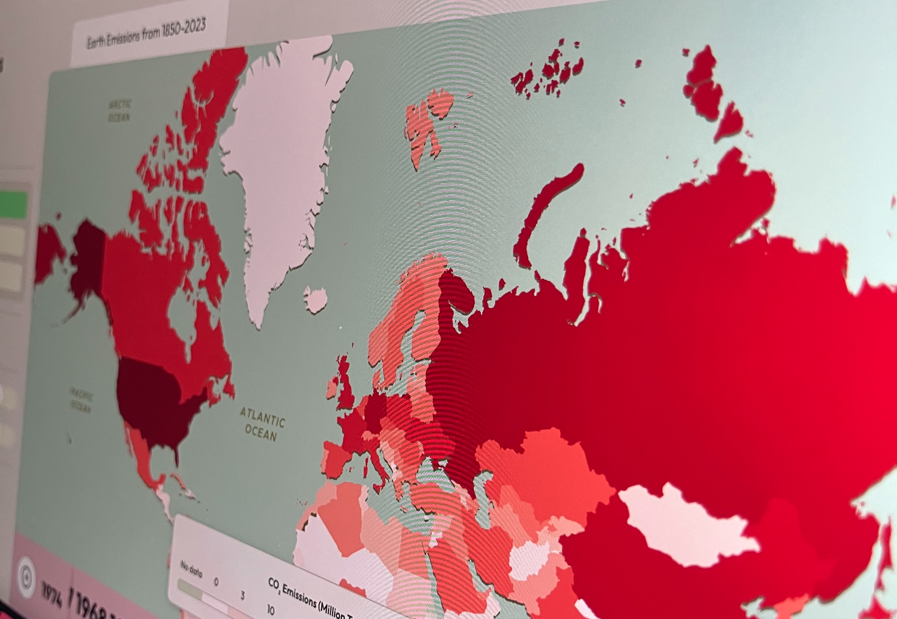
A data platform exploring global climate emissions from 1850 - 2023
Climate science is complicated, and the need for people to simply understand the enormous increase in emissions of CO2, Methane and Nitrous Oxide is critical for them to really understand what climate change is and why it is happening. We've designed and developed a data platform allowing users to visually explore emissions data and how it has changed from 1850 to 2023.
Capabilities
Data analysis, Cartographic design, UX/UI design, front-end development and in browser parsing
Challenges
Processing, analysing and transforming a large dataset into an enriched Geo dataset
Integrating custom mapping layers that are performant and dynamically update with data changes
Outcomes
A bespoke data platform allowing users to gain a deep understanding of global CO2, Methane and Nitrous Oxide emissions over time
Custom cartographic styling and data layers that dynamically update with time-series data.
There is a huge amount of misinformation and disinformation about climate change as the topic becomes increasingly politicised. Climate Change is also a complex topic with a large majority of the facts locked away in academic papers, which are not accessible to the general public. There is a great need to have tools for the public to be able to see the facts rather than opinion pieces in newspapers.

We developed this data platform to communicate an enormous amount of emissions data in a simple and visual way so people can easily comprehend the scale of current emissions globally. It is also common to think the issue is just CO2 emissions; however, we wanted to show the amount of nitrous oxide and methane that is being expelled by each country, which has a massive impact on the climate. We used source data from Our World in Data and then analysed, cleaned and transformed the data into a Geo dataset so we can use it with our cartography set-up.

We went through a range of cartographic styles thinking about how we can represent each of the data points in time but also how we distinguish them from each other. We developed the full system including a data analysis pipeline, a bespoke React frontend and in browser parsing of the dataset which renders upon user interaction promptly.